
 |
Advanced charts on normal time |
Post Reply 
|
| Author | |
Peter 
BullCharts Staff 
Joined: 09 Sep 2004 Location: Australia Posts: 241 |
 Post Options Post Options
 Quote Quote  Reply Reply
 Topic: Advanced charts on normal time Topic: Advanced charts on normal timePosted: 29 Nov 2004 at 11:48am |
|
BullCharts provides several advanced chart types including: Point and
Figure, Gann Swing, Kagi, and Renko (to name a few) that provide a
unique picture of the price history. Specifically they examine trends
in price without respect to time.
These can be accessed from the chart type dropdown: 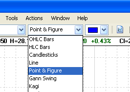 Fig. 1 - Accessing advanced chart types These chart types plot data from left to right, however the time axis does not show consistent time intervals. Rather, the charts advance in response to events such as trend changes. 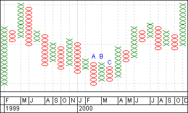 Fig. 2 - A typical Point & Figure chart This unusual treatment of time can give insight into the behaviour of a security, however some may find it difficult to get used to at first. To assist in becoming familiar with these tools, BullCharts has a mode that will allow these indicators to be presented over a conventional bar chart. Follow these steps:
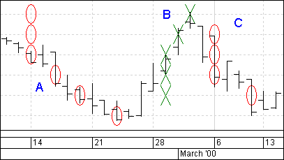 Fig. 3 - Point & Figure overlayed on price The two options behave as follows: "Overlay price plot" - this causes the bar chart to be drawn in addition to the point and figure plot. You can later select this plot and change it to candles if you like. "Use normal time" - this prevents the point and figure from making its adjustments to the time axis. It is possible to tick either option without the other, however they would almost always be used together. (Specifically if you select only the first then the price plot will appear crowded and will draw over itself). For more information on the creation or interpretation of individual chart types, there is a great deal of literature available both online and in books. |
|
 |
|
Post Reply 
|
| Forum Jump | Forum Permissions  You cannot post new topics in this forum You cannot reply to topics in this forum You cannot delete your posts in this forum You cannot edit your posts in this forum You cannot create polls in this forum You cannot vote in polls in this forum |